Matte vs Glossy: The Best Paper Finish for Framed Printable Art
The Difference Between Matte and Glossy Finishes
How does a finish change the way your printable wall art looks once it’s framed? It controls how light bounces off the surface, which shapes the color depth you and your guests see.
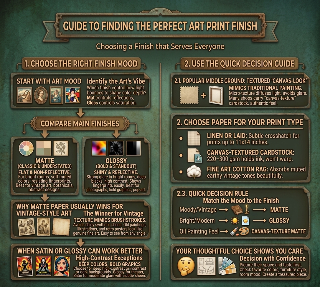
A matte finish is flat and non-reflective. It gives you soft, muted, natural colors and a classic, understated feel. Since it eliminates glare from windows and lamps, it works well in bright rooms and behind glass. It likewise resists fingerprints. You’ll love it for vintage art, botanical prints, and abstract designs.
A glossy finish is shiny and reflective. It delivers bold, vibrant colors, deep blacks, and high contrast, so photographs and colorful graphics stand out. On the other hand, it creates strong glare in bright rooms and shows fingerprints easily.
Why Matte Paper Usually Wins for Vintage-Style Art?
When you’re framing vintage-style art, matte paper is usually the better pick. Its textured surface mimics real brushstroke texture, so your digital prints look more like an actual oil painting. It additionally avoids the shiny, synthetic sheen of glossy photo paper, which helps old paintings, botanical illustrations, and retro posters read as genuine fine art.
Matte paper additionally makes life easier for everyone who sees your work. It absorbs light instead of reflecting it, so family and guests can enjoy the piece from any angle. Behind glass, it won’t create distracting reflections or stick to the surface. Its softer, muted tones suit aged-paper aesthetics, and it resists fingerprints, so you can trim, handle, and frame prints for gifts or clients without leaving smudges behind.
When Glossy or Satin Finishes Can Work Better?
Matte paper isn’t the only good choice for vintage-style art, as glossy and satin finishes can outperform it when your printable has deep, high-contrast colors, dark backgrounds, or bold graphic elements. Choose the finish that serves your space and the people who share it.
- Glossy: Intensifies saturation, so vintage movie posters and pop-art prints look theatrical. Hang them away from windows and harsh lamps.
- Satin: Adds subtle sheen and color depth without heavy glare, ideal for vibrant illustrations in moderately lit rooms.
- Exceptions: Brighter, saturated florals or bold color prints let glossy make colors pop.
Satin furthermore complements warm wood and metallic accents in mid-century or industrial rooms, creating a welcoming atmosphere for your family and guests. Your thoughtful choice helps everyone enjoy it.
Textured “Canvas-Look” Paper: A Popular Middle Ground
If you can’t decide between smooth matte and glossy, textured “canvas-look” paper splits the difference. It’s a popular choice for oil-painting-style prints, and many print shops carry it. The micro-texture diffuses light, so your guests, clients, or loved ones can enjoy the artwork from any angle without glare. It likewise mimics traditional painting supports, giving vintage reproductions an authentic, tactile feel at a fraction of a stretched canvas’s cost.
Choose the paper that fits your print:
- Linen or laid paper: Its subtle crosshatch suits prints up to 11×14 inches.
- Canvas-textured cardstock: At 220–300 gsm, it holds ink well and won’t warp in a frame.
- Fine art cotton rag: It absorbs muted, earthy vintage tones beautifully.
Pick one, and you’ll create a piece others treasure.
Quick Decision Guide
Still not sure which finish to pick? Use this quick guide, especially when you’re printing art for a friend, a client, or a loved one. Match the finish to the mood of the piece:
- Matte: Pick it for moody or vintage pieces.
- Glossy: Pick it for bright, modern pieces.
- Canvas-texture matte: Pick it for the closest oil painting feel.
When you’re choosing for someone else, picture their space and taste first. A finish that suits their style makes your gift feel thoughtful, and it helps them enjoy the art every day. Ask about their favorite colors, glance at their furniture, or check the mood of their room. Then decide with confidence. Your choice shows you care, and the framed result will reflect that effort.